

PINC BRAND PACKAGE
DESIGN CHALLENGE
PINC—People, Ideas, Nature, Creativity, is an annual creative conference in Sarasota. The design challenge was to create a full branding package for its 11th year. The visual identity needed to capture PINC’s spirit of imagination and creative energy.
Motion Designers: Kiu Cheung, Lucia Alonso
Graphic Designers: Bella Race, Lorenzo Frepoli
Project Manager: Jack Coleman
Credits
Music and Sound Design: Rin Yokoi
Creative Direction: Holly Antoszewski
Motion Show Opener

Working Collaboratively
The PINC team consists of five members. We collaboratively researched and developed the initial design direction before dividing into focused roles. Jack served as project manager, liaising with the client and ensuring the project stayed on schedule. Bella and Lorenzo were responsible for all graphic deliverables, including posters, the programme, and T-shirts. Lucia and I designed and animated the conference motion opener.
PROCESS
01. Research
PINC is an experience, its goal is to making sarasota into a capital of creativity. We familairized ourselves with how the "most creative day" in sarasota looks like, discussion with client and learning what PINC means to them.
REF: PINC Experience


02. Approach & Stylescapes
We presented the clients with three distinct stylescapes, each with a different tone and direction. The chosen direction, Untamed Imagination, draws inspiration from how PINC began. It started as scribbles on a napkin and a conversation between two friends that grew, transformed, and eventually became the conference it is today. This stylescape brings together word mapping, mark-making, and visual gestures that capture the organic growth of an idea. It’s vibrant, energetic, and full of wonder.


03. Asset Creation
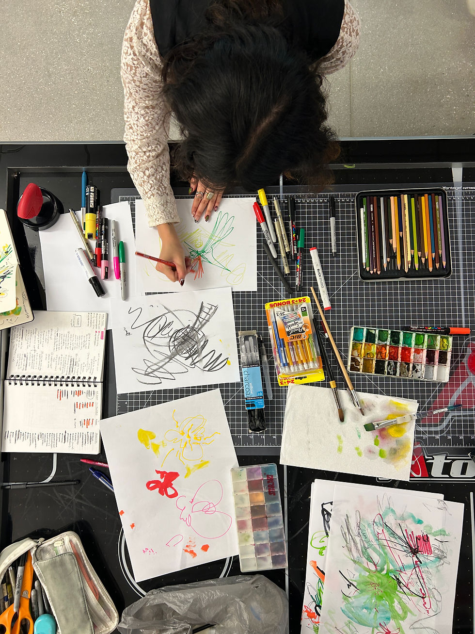

In the early stages of the design process, we decided to create some assets by hand and had a lot of fun doing it. It was refreshing to make marks with traditional media instead of the computer. Many of these hand-made assets ultimately made their way into the final graphic design deliverables.

03. Motion Exploration


We explored Blender’s Grease Pencil to animate an organic, hand-drawn style. Its hybrid 2D/3D capabilities made it possible for expressive marks to live naturally within 3D space.
04. Story Concepting

We placed a strong emphasis on crafting a moving, compelling narrative for the motion piece and refined the script through many iterations. The story unfolds in a storybook style, redefining what people, ideas, nature, and community truly mean through an imaginative, curious lens. It’s about seeing things differently, and we hope the piece creates moments that feel heartfelt and relatable.
Early Storyboard
Getting inspiration from storybooks

05. Style Frames


06. Animation
We created a series of animated mark-making elements that were used throughout the piece, layering them and adding subtle movements to bring them to life. These gestures helped unify the visuals and tie the animation back into the rest of the branding package.


For the animation process, we moved back and forth between Procreate Dreams and After Effects. Some shots, I would start by creating a rough animation in After Effects, then draw over it in Procreate Dreams to achieve a more natural, authentic hand-drawn style.


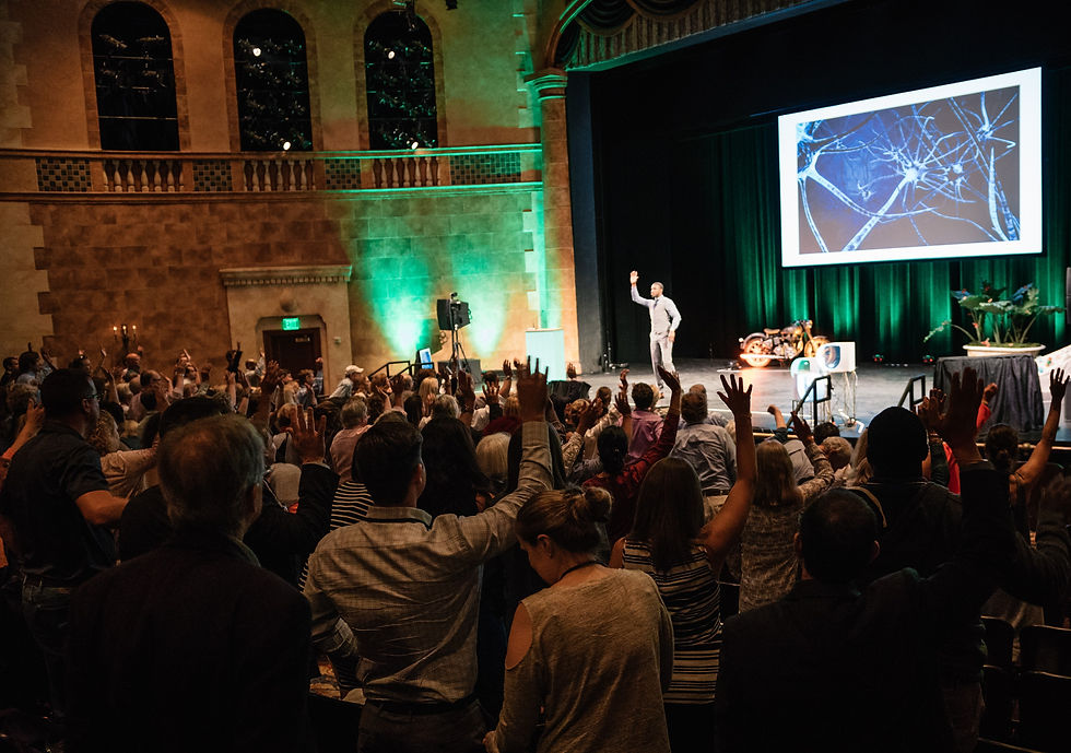
Graphic Deliverables and Event Photos
Print and graphic deliverable are designed by Bella Race and Lorenzo Frepoli.


Thanks for stopping by!
This project deepened my love for type design. It was a great learning experience in using simple graphics, icons and symbols to convey meaning, definitely a fun challenge in visually communicating words.