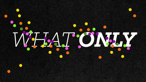

TEDx Teaser
The goal of this project was to create a 10–15 second teaser for a TEDx talk, something that captures the viewer’s imagination and sparks enough curiosity to make them want to watch the full talk.
2025 Social Media, Typography Animation
Design and Animation: Kiu Cheung
Sound: Kelly Warner
Voice: Embracing Your Weirdness by Chris Williamson

How do you make someone stop... and stay?
Before we could inspire, we had to interrupt the scroll.
TEDx has powerful content, but first we need to earn attention. My goal is to create a snappy, exciting teaser for social media, something bold enough to cut through the noise and make people want more before the story even begins.
01. Research

The first step in this project was analyzing the talk and finding that one quote that can instantly move people.
Theme
Tone
Quote
Your weirdness is your unique superpower, something to embrace. It's what makes you more magnetic and memorable.
Motivating, light-hearted, uplifting, and relatable.
“This is the imperative we all have, it is your duty to give the world what only you can give it because only you can.”
02. Approach
The next step is exploring two different approaches to the project. My first approach is an illustrative story while the second one is typography animation. Concept 2 was the chosen direction.
THE MARK
A vibrant, unique character enters a monochromatic world where it doesn’t fit in. As it moves through the space, it transforms the environment with bold shapes and rich colors. This visual metaphor highlights the power of embracing your individuality, what makes you different is what the world needs.
.png)
03. Design Quilt
I explored a ton of styleframes by building a design quilt, a collection of visual experiments laid out side by side, with a mix of quieter and louder moments.
At first, I focused on making beautiful style frames, but that’s not enough. The real challenge is designing visuals and motion that can quickly communicate the meaning of each word. Take the word Duty as example, it’s structured, rigid, and can feel overwhelming.
The first attempt looks appealing but lacks that feeling. In the second, I focused more on the connotations of duty and used a clock, arrow, repeated type and a framing composition to reflect its demanding nature, a much better representation.
Design with Meaning. What does the word make you feel?


First Attempt
Second Attempt
04. Animation
Transitions transitions...
Once the design phase is done, I jump into animation. Since this project is made for social media, the runtime is super short, so transitioning between styleframes becomes a real challenge.
The goal is to avoid just simple cuts, but create smooth, exciting transitions that connect the frames and make them feel like they belong in the same world, rather than looking like separate, disconnected designs.
scroll to see how the transitions progressed →
05. Final


Thanks for stopping by!
This project deepened my love for type design. It was a great learning experience in using simple graphics, icons and symbols to convey meaning, definitely a fun challenge in visually communicating words.


